Baby Products

This is going to be an ongoing post as I discover more...

Being a new parent I paid a lot of attention to baby products design. There are a lot of great products but there also products that make you think "have anyone tried this with a baby???"

Onesies
It's my first baby. I was nervous just holding a baby. Putting a onesie over the head of a baby that doesn't hold her head yet made me think that I am going to hurt her. Yes, I watched videos about how to do it but I never felt very confident doing it. Most onesies that I find in U.S. must go over the head. Babies already cry a lot and putting something over their heads doesn't make them cry less. A wonderful alternative is a kimono style onesie, widely used in Japan, for instance. I was lucky to get many of them from my brother who happened to have a baby just a bit older than mine. Kimono onesies are just so much easier to put on. You open the onesie, put the baby on top, put arms in, and button up/tie up/zip. It's a breeze. Once you try it, you wonder why so many over the head onesies on the market? One explanation is that as I discovered over the head onesies work better for older babies that can hold their heads well and can roll or crawl. Dealing with additional buttons on kimono style onesies is tricky when the baby is trying to run away from you.

Another type of onesie that has a flaw is a long leg onesie that only opens on one leg. You have to completely unbutton the onesie to take the other leg out and change diapers. Since you change a lot of diaper for a newborn, ease of diaper change is essential.

Sleeping sacks
Oh my sweet baby is a sleep, I can finally snuggle on a couch with my husband and watch a movie. I put my baby into a sleeping sack, zip, zip, and the baby is a wake and my movie watching plan is gone. Some zippers and velcro make too much noise and wake babies up. Some sleeping sacks require inserting arms into the opening which also can wake up babies. Sleeping sack that opens at shoulder level avoids this problem.  Newborns sleep a lot so products that make too much noise or require moving a baby a lot are not ideal.

Strollers
Surprise... we use Bob and live in Seattle. We do love Bob but it has a few flaws. Bob's breaks are loud; they have a pretty tight string and it snaps when released. We use our hands and not foot when our baby is asleep. Velcro on the roof is also not quiet and can wake up our baby. The pocket at the back of the stroller is handy until you fold the stroller and everything falls out. The pocket doesn't zip up. 

Spoons
A silicone spoon we got for our daughter was colorful and soft. Our daughter liked it. One day she played with it and put it way too far into her mouth which made her gag. Poor baby wasn't happy. Baby items designs should always assume that babies put products into their mouths. That's just what babies do to learn about this world. I don't yet have a good recommendation about what to do with a spoon because it is supposed to go into the mouth but there just needs to be something that prevents it from going to far. Please note that I think that it's an issue for younger babies; now my daughter doesn't put it too far.

Diapers
One world describes our diapering experience now - chase! Baby crawls, I crawl. My baby spends zero time on her back lying around so that's not an option. Luckily she loves watching airplanes in the window and I have a few seconds to put a diaper on. Cloth diapers with snaps work better in this situation because you know where to snap. Disposables are more difficult because they seem to bunch up easily and velcro doesn't go the right way and creates leaks later. I don't see too many pull up diaper on the market. Interestingly pull-ups are popular in Japan.

Carriers
We own a Beco carrier. It is a comfortable carrier that puts most of the wait on the legs and not on the back. While we use it on a daily basis and our daughter seems to enjoy riding in it facing out, there are a few inconveniences for the parents. The carrier is equipped with safety buckles that requires you to press a button and pull out the buckles at the same time. This operation requires both hands. Unless you are with your partner, usually there is a baby in your arms and both hands are not available. It's OK if you are putting a baby in/out at home but for a place like an airplane it makes things very interesting and you may end up sitting with the carrier attached to your waste for the duration of the flight. Safety of a baby is of course important so I can see the reasoning behind the "safety" buckles. The problem is in the design of these buckles. If you are not holding your baby while trying to unbuckle the waist it creates a danger for the baby even if you are sitting. So if you consider the buckle in isolation, it is safe, but if you consider environment in which the carrier is used, it is not that safe after all. Babybjorn carrier has a superior buckle that doesn't require both hands and that a baby cannot open easily. Most carriers also lack pockets. If you are carrying a baby it is not very convenient to also carry a purse. While some can fit everything in their pockets, I would prefer a little pocket for the essentials (keys, money, cards, phone,) in a carrier itself.

Baby hats
Babies enjoy pulling their hats off. Wearing a sun hat in Seattle is more of a fashion statement than a requirement on most days. When traveling in Hawaii, it was a must for our baby to wear a hat; her peach fuzz doesn't provide much sun protection. Most hats we tried to put on, came off as quickly as we put them on. The only hat that stayed was an iplay brand sunhat for boys. I didn't yet exactly figure out why our baby was ok with it. It has very lightweight fabric, maybe it is less annoying for a baby. It also seems more breathable because of the mesh liner. Here comes winter; we'll see what happens with winter hats.

TO BE CONTINUED...
Cold chairs

While working in a cafe today I wonder if cold chairs here are intentional. Would people order more hot drinks? Would they stay less and open room for more customers? 

I always wonder how we could prevent certain individuals from hanging out in nice Seattle parks. There is a new park in Ballard intended for kids and families. Now the main occupants are homeless people smoking pot and drinking. Maybe we need to play non-stop kids music? Are there successful sitting spaces that prevent people from sitting there for hours? 

Amazon (Jeff Bezos) talks to customers

The homepage of Amazon today presents a "personal letter" about Kindle Fire from Jeff Bezos. That is a nice touch. It is not frequent when business owners talk to you. Even though the letter has probably composed by multiple teams it still gives a good impression that Jeff Bezos cares about his customers and considers it important to talk "directly" to them. Inclusion of social share option at the bottom of the letter is also a good idea to spread the word.
Am I going to buy Kindle Fire? No, I am still pretty happy with my iPad :). $49.99 one-year 4G data package sounds attractive if I didn't have a table yet. Also Kindle Fire HD 4G is not yet approved by FCC.

New York Times falls into a tunnel vision trap


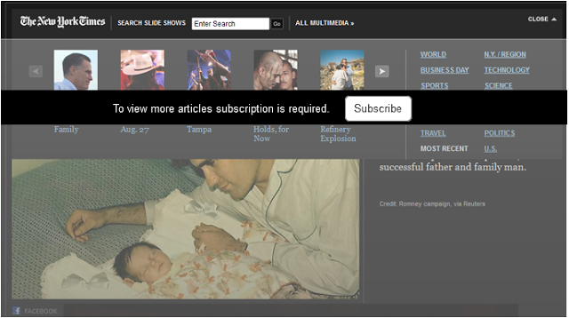
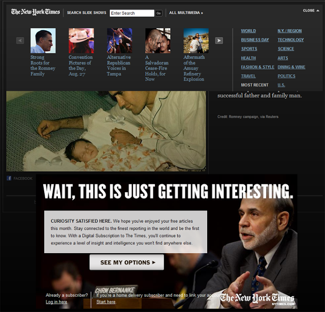
Jacob Nielsen recently wrote about tunnel vision and selective attention. Content presented outside of user's path can become invisible. New York Times fell into the tunnel vision trap. Today I went to take a look at the slideshows. Controls to navigate slideshow carousel don't work, links don't work. Hmm, that is strange. Later I find a note underneath saying "Wait, this is just getting interesting". Oh, it actually means I need to buy a subscription to view more articles.
There are a couple of design drawbacks
  1. Subscription information looks like an advertisement (big screaming letters); users ignore content that looks like an advertisement.
  2. Subscription information is outside of vision tunnel;  users' goal is to view the slideshow so they look at the pictures and controls right next to the pictures but subscription information is separated by a big image. 
  3. Subscription headline may sound catchy but it doesn't relate to users. "Wait, this is just getting interesting" doesn't say anything about required subscription.


Current design

Option to redesign the page


Non-actionable buttons on confirmation dialogs


Nobody wants to read much text. Users want to accomplish a task and be done. When buttons have non-descriptive names e.g. "Yes" "No", users have to click any button without reading and deal with unexpected consequences or read lengthy text. Here is an example of such a dialog. Intuitively, I would click "Yes", since I am thinking "Yes, I want to continue..., I just want to proceed to the site". Then it turns out that "Yes" actually means "No, don't show me all of the content..." So I try again, read, and click "No". Everything on this dialog is opposite from my expectations.


Ideally this dialog shouldn't pop up at all because it doesn't really add any value and the implications are not clear. If the dialog has to stay, I would suggest changing it to something like this:

Cars and apps

New cars are expanding into the territory of features that are commonly available on our smartphones, and more: music streaming, radio programs on demand, Yelp, browsing, geo-fencing, lock/unlock, arm, remote car starters, trunk release, panic, locate car, parking meters, anti-collision. And here come the social apps: Facebook and Twitter.

How much tweeting and facebooking do we really need to do in the car? The dangers of texting while driving have already been researched, and it turns out that it's comparable to the risk of driving drunk. Nowadays humans are so addicted to new information that it is hard to image that we'll be able to convince everyone to just stop using their phones for safety's sake. 

There are a few options: expensive penalties, automated phone shutdown, user experiences that minimize driving distractions. In Washington, the ticket for driving while talking/texting on the phone is $124 - the same as driving in high occupancy vehicle (HOV) lane even though the risk of killing someone is much higher when you are on the phone vs. when you are in HOV lane. Based on observations during my daily commute, $124 is not working. I have to admit that I sometimes use my phone for a quick chat as well. If the ticket were $1000, I would think much harder before picking up my phone. I also sometimes check Facebook when I am at the stoplight or in a stop-and-go traffic situation.

Ideally we all just should stop using our phones. At some point I hope there will be a regulation that would force phones to disable all features except emergency calls when it detects that you're the driver.

But let's assume people are not going to give up using apps and smartphones in the car. How can we make designs that are more car appropriate? Some would say that it would encourage us to use our phones even more! True, but I am making an assumption that people would use their phones anyways, so making it easier could make things a bit safer. A tiny bit...

Here are a few thoughts:
1. Quick switch to enable voice commands. Quick is the key. If the switch involves too many steps people will not do it since it's too much work. Fewer steps also would allow users to make the switch more safely while driving.
2. Disable text input. Mercedes already does it for its cars' built-in interface: texting functions are disabled when the car is moving.
3. Disable visual notifications. When there is a visual cue, it is much more tempting to look.
4. Disable password lock when the car is moving. When a device is locked it doesn't respond to any voice commands and you cannot easily switch to car mode. Users pick up the phone and type their password while driving... which is what we are trying to avoid.
5. When navigational apps are on, keep the device screen on so that the user doesn't need to "wake up" the device to view the map.
6. Move apps that are used in the car (e.g. music, email, maps) to the top of the list (or filter the rest of the aps) so that the user doesn't need to scroll the screen.
7. Frequent operations use physical buttons that the users can feel and click with their hand without looking at the screen.


Related articles:

Design of every day skiing things

Skiing on regular basis made me think about "What does a skier need as a user?" Here are some thoughts based on my personal experience. Let me know if your experience is similar and if you have anything to add.


Phones
Have you ever tried making a call from your mobile phone when skiing? In my experience, it's quite an ordeal. Since outside pockets don't offer enough protection I stash my phone in the inside pocket, which requires me to unzip my jacket to get it out. I usually end up unzipping my jacket on the lift when the windchill is worse. It is not very easy to grab a little zipper with big gloves or mittens. Now my phone is out. I touch the screen, nothing happens. Right, the touchscreen only likes bare fingers because it needs to sense the bioelectricity of your finger tips. In addition to the touchscreen my BlackBerry has a trackpad which works with gloves or through a Ziploc bag. I frequently use a Ziploc bag to keep the moisture away. In this case, a BlackBerry is more usable than an iPhone.
Navigating through the icons wearing gloves is still tricky; your hand is much less precise and clicking on the wrong thing is unavoidable. I recently set up voice dialing so I'll be trying that next time, although I prefer using voice dialing with no people around. Being in the Northwest, skiing is often accompanied by wet snow or drizzle so I have to work fast if I want to ever use my phone again.
"Talking on the phone" usually resorts to leaving, listening, and reading messages because you cannot hear ringing when skiing. That is probably a good thing because who wants to hear ringing while enjoying the company of fluffy snow and a tree run? So, no I don't want a louder ringer. What I probably need is an easy way to tell my buddies [I am still on the lift]/[I am in the lodge]/[Ready to go home]/[Great snow at Brand-x]. Some might suggest wearing a head set. Anything inside my ears is not my cup of tea; I am in nature, the only thing I want to hear is the sounds of skies shredding the snow, the wind, and the birds, and maybe an occasional "woohoo" because the snow is so deep.

Cameras and photos
Unless we are expecting some spectacular views, we very rarely bring our camera because it's big and it's a hassle to use it while skiing. So we use our phones. Just like with making phone calls, it takes too long to take a picture with your phonw (unzip jacket, take off gloves, zip jacket up if it's cold, take the phone out of the Ziploc bag, navigate to the camera app, try to click the right button to take a picture).  Usually I am taking picture on a ski run and not from a lift, so my goal is to take a quick picture and continue skiing (otherwise my husband will be out of sight). And who wants to wait on a nice ski day! As they say, "no friends on a powder day."

"Gaposis" between the sleeve and gloves...
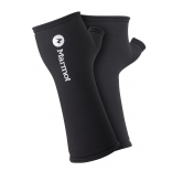
I get cold really fast so any gap in my clothing has to be sealed or I have to stop often and adjust my clothing. For some reason gloves and mittens never go high enough to cover my jacket sleeve without slipping down, creating a door for the cold wind. Last year I discovered wrist warmers; that is a must-have item on my ski clothing list. It does add a little of bit of bulk inside, but it's worth it. And it helps when using your phone or eating a energy bar without gloves; at least only your fingers freeze and not your whole hand.

Lifts
I am short so the restraining bar on chairlifts never hits my head when someone puts it down without warning. It's a different story for my tall husband-ski-bum Erik, but luckily his helmet mostly protects him from lift bar attacks. Whoever designed these bars didn't account for extra body height due to helmets.

The two person High-Campbell lift (aka elbow cracker) has an angry pole in the middle that hits you pretty hard if you don't face it when the lift approaches. And when it comes to T-Bars and Platter lifts... I'll leave it up to the guys to describe the intricacies and dangers associated with those designs.
Chairs that have nice padding, don't cut into your back, and keep your butt warm are always appreciated. Some of Crystal Mountain's lifts now include a built in map in the restraining bar, which directionally-challenged people like me find useful.


Road, snow, and wind conditions
Driving to Crystal takes about two hours from Seattle so before leaving the house, we check the conditions to avoid disappointment. Crystal's website is good but in some cases Facebook turns out to be more up to date. A few weeks ago we had a big snow storm and not to miss an opportunity to bathe in fresh powder, we took a day off and drove to Crystal. Lower elevations on the way were hit hard by strong ice rain and there were many fallen trees. When we got to Enumclaw (after an hour drive) and stopped for coffee, it turned out that the remaining road leading to Crystal was closed due to falling trees blocking the road. Crystal's site didn't have this information; most information came from skiers posting on Crystal's Facebook wall. A bit disappointed, we drove back to Seattle. The road to Crystal only reopened the next day. It would be nice to get notifications about events that could make skiing better or worse (new snow, ice, lift closure (happens due to to strong winds), road closures, no place to park by the resort). 


To conclude, here are my ski-bum user goals and design elements that could make a skier happier:

Goals
1. Staying in touch with ski buddies (to meet during lunch, before going home, to ski a run together).
2. Stay informed about road, snow, and lift conditions.
3. Taking pictures quickly without interruptions to my skiing flow.
4. Staying warm and safe.

Design elements
1. Touch screen that can be used wearing gloves.
2. Ability to switch phone to a ski mode that would change the screen to showing only the essential controls e.g. Call, Ski lift status, Location Check In, Camera.
3. Big buttons that could be easily pressed wearing gloves.
4. Critical notifications that can impact skiing (e.g. road closed, your favorite lift opened)
5. Protective, padded, and sealed outside jacket pockets with big zippers to store a phone.
6. A phone that won't be ruined in wet conditions.
6. Tall gloves and mittens that go a few inches above the wrist.
7. Taller lift bars, soft seats (hot cocoa would be nice too :)), and no middle pole.

Unexpected use of a cooking tong...

Yes, I am short and cannot reach the top shelf in my kitchen. Solution... a kitchen tong! I successfully used it to get little vases without needing a chair. Of course, there is always a chance that something will fall on my head in the process...I will be taking my chances. I need a tong that also has a little camera so I could actually see inside of the cabinet. Now I just need to find a lot of short investors to invest into my idea!

Following branding color vs. following established standards

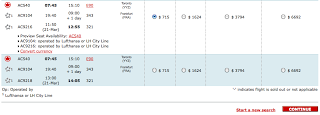
Air Canada picked Red color for the primary buttons.
Red is obviously the main Air Canada color but is it appropriate for the primary buttons?
It threw me off right away; oh Cancel? oh it's Continue? Interesting...
Going with establish rules is more intuitive (Red - don't go, don't do, be careful). Branding is important but in this case the color is the wrong choice especially having so many other color to chose from.

Being an online shopper for a bit

Banana Republic:


Website has a big section of the page that keeps changing from a picture of a woman to a picture of men. Flashing interferes with my page scanning. Having a static image containing a men and a women could accomplish the same goal without flashing.

The site has links to Gap, Old Navy... The size selection is not preserved between the sites; it adds extra work that could be avoided. Time spent looking for tops is spent on changing the size.

Gap:

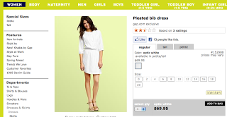
White categories text on lime background is just not very readable. Yes, it looks spring like but more contrast is needed here. 

Clicking a little quick preview button shown on hover of the image opens a layer dialog with additional information about the product. Nice, my location on the inventory page is preserved without clicking back and scrolling. On the other hand, my expectation as a user that clicking preview button is the same as clicking on the image. Quick preview button is also not always visible; I have to hover on the image, and then scroll to the bottom left; that is extra work. Could a permanently displayed button do the same job? I think it can.

"See all" is selected by default when a category is selected. That what I always click when I am trying to buy something so I like it. Product pictures have a good size and give me a good idea what the product is quickly.

There is "Based on X ratings..." information at the top of the screen. I want to read reviews, but wait.. it's not clickable. I have to search for another control. Here it is in small font "See all reviews".  Oh now I also see that there are reviews visible on the product page itself. I didn't notice it because it is below the fold. Making "Based on X ratings" clickable would be beneficial.

When you click on the image to see full product page and then click you are taken to exact place where you left of without scrolling.  A lot of sites don't do this and make you scroll which is too bad since users could be viewing more products.

Immediate zoom on the product page is great! No button clicking, I can see details right away.

JCrew

Please add a quick preview :)
Clicking on a product, clicking back is too much work for me.  And the place on the inventory page is not preserved; I have to scroll and search where I left off.

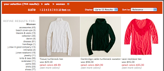
Having "Sale" in the top category is handy... If I want to see sales items I will still search for it even if you hide so giving it to me right away is good.

Right alignment of the subcategories make is harder to scan. I am not quite sure why right alignment has been chosen here. To line up number of items in each category? That is not that important to me as uses; I don't decided "click/not click" based on the number. Finding the category quickly is more important to me.

There is no "See All". Sigh.

To zoom into a product image there are too many clicks: click on an image and a dialog with a bit bigger image comes up (it is bigger but is not significantly bigger to be able to see the details), click zoom in and then move image around. Gap's zoom solution is better. Unlike Gap, JCrew has multiple pictures of the product on a model from different sides hovering on the image changes the preview image. Nice.

There are no reviews. Reviews seems to be expected nowadays.

:) I better stop usability exploration or I'll buy a cute trench coat!

Guilt people into participation?

Firefox showed me a very clever statement today:
"Will you help improve Mozilla Firefox by sending anonymous information about performance... [Yes][No]"

Click "No" makes me feel like I didn't help someone and I feel a little guilty. I bet I would not have the same emotional response to "Please provide feedback.." request.